Virtual Training Co - Professional Development
  • Home
  • Schedule
  • Courses
    • Microsoft Office >
      • O365 >
        • Groups
        • Flow
        • Mobile Apps
      • Access
      • Excel
      • OneNote
      • Outlook
      • PowerPoint
      • Project
      • Publisher
      • SharePoint
      • Teams
      • Visio
      • Word
    • Project Management >
      • Project Management Fundamentals
      • Project Management Essentials
      • Time Management
      • Communication
      • Chaos Clutter and Control
      • Organization
    • Adobe Acrobat
  • Focus Sessions
  • Training Options
    • Virtual Training
    • Custom Training
  • Contact Us
    • About
    • Support
    • Helpful Tips

Excel New Chart Types

3/24/2018

0 Comments

 
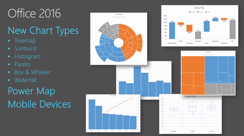
There are new chart types in Excel 2016, including Waterfall, Sunburst, Tree map, Funnel, Histogram, Pareto, and Box and Whisker. They can be used from programs like, Excel, Outlook, PowerPoint, and Word. Here are a few details:
  • Waterfall - A Waterfall chart provides a simple visual of the running total of your financial data, identifies the contributions and provides clear subtotals, giving you a ready-to-present financial report in a few clicks.
  • Histogram - Commonly used in statistics, a histogram automatically displays the frequencies within a distribution. In this example, the horizontal axis represents the book price. Each column, called a “bin,” shows the number of books within a given price range. Here we see that this bookstore has a good distribution of books, both high-end and low-end.
  • Pareto - Using the Pareto chart, you can automatically sort the frequency of the most prevalent issues (the bar graph) and then show the additive contributions of each issue as you move along the horizontal axis (the line graph). The Pareto chart allows you to prioritize the improvements you want to make in the bookstore to address the most critical issues.
  • Box & Whisker—bringing statistics to distribution. Like the Histogram chart, the Box & Whisker chart shows the distribution of information. For deeper analysis, this chart goes further by providing key insights about the distribution in one view, including range, quartiles, mean and outliers. And you get all of this information with a few clicks.
Picture
0 Comments


Leave a Reply.

    Computer tips that will increase productivity and your overall computer experience.

    • These helpful tips can make a big difference in your workflow—and save you tons of time in the process.
    • You may be wondering whether shortcuts really help…they do. If you become proficient with 3 or 4 common shortcuts, you will save time.
    • ​New tips added weekly

    Author

    With over 25 years in the computer industry, JoLynn Rihn has been helping people to become more efficient and effective with their computer software. She offers tips on using the latest programs so that using a computer can be more easy and fun to use.

    Archives

    December 2018
    October 2018
    March 2018

    Categories

    All
    Excel
    Helpful Tips
    Microsoft Office 2016
    Word

    RSS Feed

Microsoft Office Training
​Project Management Training
​​Adobe Acrobat Training
Virtual Training  Co    (608) 769-4203
​Professional Development Live Instructor-led